What Does a Small Business Website Actually Need in 2026?
Not what a web designer can sell you. What a customer looks for, what Google needs to see, and what keeps the site working once it is live: a practical checklist for UK small businesses.

Most small-business websites fail for boring reasons. Not because they lack a chatbot or an animated hero, but because a visitor on a phone cannot tell within a few seconds whether the business does the job they need, in the place they live, and how to get hold of it. This guide is about getting those boring things right, then knowing what to leave out.
Start with what a visitor is trying to do
Nobody browses a plumber’s website for pleasure. A visitor arrives with a task: check you’re real, check you do what they need, check you cover their area, and get in touch. Everything on the site should make that task shorter.
That means the first screen of the home page, before anyone scrolls, should answer three questions in plain words:
- What do you do? “Plumbing and heating” beats “solutions for your home”.
- Where? The towns, boroughs or radius you actually cover.
- What next? A phone number that can be tapped, and a button for the people who would rather write.
If you only fix one thing on an existing site, fix this screen. It does more work than the rest of the site put together.
The pages most small businesses actually need
A brochure site for a trade or local service usually settles into four or five pages. More than that is rarely a sign of a better site; it is usually a sign of a menu nobody can navigate on a phone.
- Home. The proposition, the area, the contact route, a short list of services and something that proves you’re a real business.
- Services. Each thing you sell, named the way customers search for it, with a short honest description. “EICR” and “landlord certificate”, not “compliance solutions”.
- About. Who you are, what you’re qualified or registered for, how you work. Two truthful paragraphs beat a page of adjectives.
- Areas. Where you work, written the way locals say it, so a customer in the right place recognises their own street.
- Contact. Phone, email, a short form, opening hours, and what happens after someone gets in touch.
Different businesses, different structures
The five-page pattern flexes with the business. The mistake is copying a competitor’s structure without asking what your customers check first.


- An electrician is often found in a hurry. The site needs the areas covered and a tap-to-call button in the first screen, then registration and insurance where people look for them.
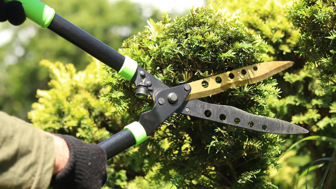
- A gardener is judged on photographs and on whether the round reaches the customer’s road. A gallery of before-and-after work carries more weight than a long services list.
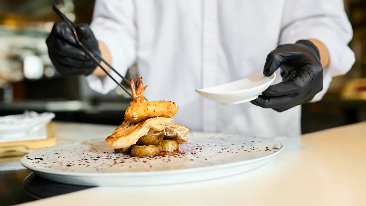
- A restaurant is chosen on the menu, a few good photographs, tonight’s opening times and whether a table can be booked without ringing.
- An accountant is chosen on clarity and trust: which businesses they work with, what happens in a first conversation, fees explained plainly, and professional membership shown if it’s held.
The industry pages on this site go into how each kind of business is bought, if you want to see the pattern applied to yours.
Mobile first, because that is where your customers are
For most local businesses the majority of visits arrive on a phone, often from someone standing in the problem: a kitchen with water on the floor, a high street looking for lunch, a car park outside a nursery. Google also uses the mobile version of a site as the basis for how it understands and ranks it, so a site that only looks right on a laptop is being judged on its weakest form.
“Mobile friendly” is not a box to tick. It means:
- the phone number is a tap-to-call link, and it stays reachable as the page scrolls;
- text is readable without zooming, and buttons are big enough for a thumb;
- forms are short and ask only what you need to reply;
- photographs are compressed so the page loads on a weak signal;
- nothing pops up over the content the moment it appears.

Trust signals, as long as they are true
People are handing you their house keys, their car or their teeth. They look for proof before they look at anything else. The proof that works is specific and verifiable:
- Reviews from Google, Checkatrade, Trustpilot or wherever your customers actually leave them, linked as they are. Never write your own, and never paste in reviews you cannot show. Fabricated consumer reviews are an offence in the UK under the Digital Markets, Competition and Consumers Act 2024, and customers can smell them anyway.
- Registrations and memberships you hold, shown where they matter: Gas Safe beside heating work, a GDC number on a dental site, an HCPC registration on a physio’s team page.
- Photographs of your own work and your own people. A phone photo of a finished job in good light beats a stock image of a smiling stranger.
- A real address or base, opening hours and a named person to contact. A site with no human on it feels like a lead-generation front, because it often is.
One clear next step per page
A page should have one obvious thing to do next. For an urgent trade that is calling; for a planned job it is a short quote form; for a restaurant it is booking; for a professional it is arranging a first conversation. Give each page its primary action and let everything else be secondary.
Two things reliably reduce enquiries: asking for too much in a form (name, phone and one question is usually enough), and making the customer hunt for the button. If you have to explain how to get in touch, the design has failed.
The technical basics nobody sees
None of this is glamorous. All of it affects whether the site works and whether Google shows it.
- HTTPS. The padlock. Browsers warn visitors about sites without it, and Google has treated it as a positive signal for years. There is no reason for any site to be without it in 2026.
- Speed. Google measures loading, responsiveness and visual stability (its Core Web Vitals), and slow sites lose impatient visitors before any measurement matters. Compressed images and lean code do most of the work.
- Titles and headings. Every page needs a descriptive title tag, one clear H1 and sensible sub-headings, in the words customers use rather than the words you use internally.
- Alt text. Short, plain descriptions of what each image shows, for people using screen readers and for search engines. Not a list of keywords.
- Accessibility. Readable contrast, keyboard-friendly navigation, properly labelled forms. It is good practice, it widens your audience, and businesses providing services to the public have duties under the Equality Act 2010 that a well-built site helps meet.
- Google Search Console. Free, and the only way to see whether Google is actually indexing your pages and what people searched for to find them. Every business site should be verified in it.
- Google Business Profile. Not part of the website, but the site should link to it and match it exactly: same name, same address, same phone number, same hours.
- Analytics, with consent. Knowing which pages people read and where they leave is useful. Do it with a compliant consent approach, not a banner nobody can dismiss.
If you want to go deeper on the search side, our practical guide to local SEO covers what Google looks for from a local business.
Keeping it working after launch
A website is not a leaflet. Most small-business sites run on WordPress, which is a good choice precisely because it is so widely supported, but it needs looking after: core updates, plugin and theme updates, backups, security monitoring, and a check now and then that the contact form still delivers. Sites that are launched and forgotten tend to break quietly. The form stops sending, a plugin conflicts with an update, the SSL certificate lapses, and the first the owner hears of it is a customer saying “I tried to email you”.
Whoever looks after the site, the questions to ask are simple. Who applies updates and how often? Where are the backups and how quickly can the site be restored? Who do I ring when it breaks? How do I get a price or a phone number changed, and what does that cost?
What you can leave out
Much of what gets sold to small businesses adds cost and friction without adding customers.
- A blog you will not write. Three posts from 2021 make a business look closed. Only start one if you will keep it going.
- Chat widgets and pop-ups. On a phone they cover the thing the visitor came for. A visible phone number does the job better.
- Sliders and animated heroes. They delay the one message that matters and rarely get read past the first slide.
- Stock photography of handshakes and headsets. Everyone recognises it, and it says nothing about you.
- A page for every service variation. Group services the way customers think about them. A long menu is not a sign of a thorough business, only a hard-to-use one.
- Features you have not been asked for. Online booking, customer portals and e-commerce make sense when customers want them and you will run them. Until then they are complexity you pay for twice: once to build and again to maintain.
If you would rather not run it yourself
Everything above can be done by a competent freelancer, a small agency or, with patience, by you. The question is who keeps doing it. Hosting, security, updates, backups and small changes are ongoing, and they are the parts most owners have neither the time nor the interest to manage. That is the case for a managed service, where design, hosting and upkeep come as one arrangement with one number to call.
Whatever route you choose, hold it to the same standard: can a customer on a phone tell what you do, where you do it and how to reach you within a few seconds? If yes, the site is doing its job. If not, no amount of extra features will rescue it.